
Guest Post by Susan Beal
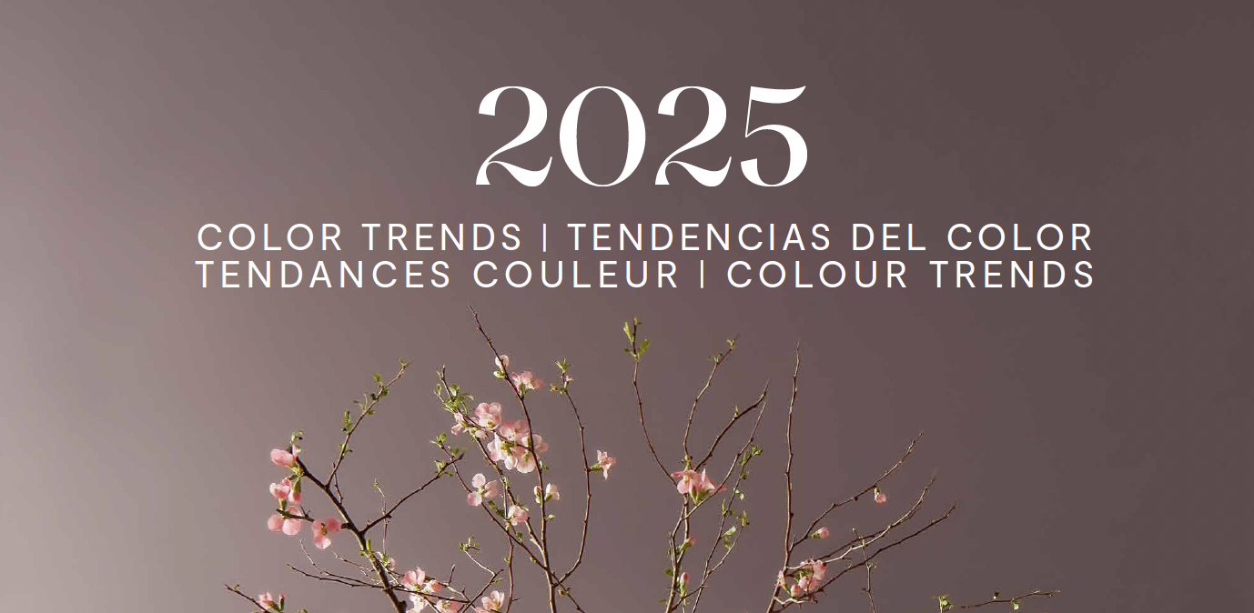
One of the most creative (and challenging!) parts of a remodel or home update is crafting color palettes. As an interior designer, I love working with my clients on color consultations, because the results are so personal – and add so much instant style to any space. And let’s be honest, spending hours flipping through a whole stack of design magazines or standing in front of a display of hundreds of paint chips at the hardware store can feel very overwhelming, so Iet’s keep it fun, starting off with some 2025 inspiration!
As we enter the new year, we’re seeing some truly beautiful and inviting palettes forecasted. The continuing shift away from primarily cool, composed neutrals, grays, and whites to include a bigger range of timeless, gorgeous colors with more visual texture and warmth has been a major trend in interiors, so even smaller changes like painting an accent wall or choosing new curtains can bring a pop of fresh, appealing energy to a dated or chilly-feeling space.
From visiting High Point Market last year to the new 2025 color forecasts from some of my favorite companies like Sherwin-Williams, Benjamin Moore, Pantone, and Miller Paint, there are some wonderful options for homeowners to consider. Along with the very inspiring palettes and individual colors themselves, we’re seeing stylish and inviting directions like color-drenching ceilings, walls, and trims in allover lush colors; creating intentionally peaceful spaces as a respite from stress and technology; highlighting elegant and classic “grandmillenial” elements like moldings, railings, artwork frames, and archways; and a refreshing take on natural materials like warm woods, cork, metal, and stone, all bringing a timeless, welcoming sensibility. What styles are you most drawn to, and most importantly, how do you want to feel when you walk into your home?

Benjamin Moore has chosen Cinnamon Slate for their 2025 color of the year, “a delicate mix of heathered plum and velvety brown that brings a smooth familiarity to any design.” It transcends the dusty mauves of the 1980s to add a quiet, elegant, and richly nuanced hue to your home, as a neutral but complex color that works in nearly any setting.

The rich palette of ten iconic and complementary Benjamin Moore colors, including Cinnamon Slate, are striking in color-drenched or monochromatic settings, but also complement whites and neutrals – the perfect finishing touch to an updated and refreshed living room, bath, or kitchen. These three rooms share a welcoming and timeless style, while also feeling calm and composed. Cinnamon Slate works so well in living room and entry designs, while Tissue Pink adds soft, glowing color to a serene white kitchen, and Stained Glass is gorgeous in a vintage-inspired bathroom, dramatically offsetting the white clawfoot tub. See more of the 2025 palettes and download the beautifully inspiring Color Card Lookbook at Benjamin Moore.


Speaking of color-drenching, I asked one of our favorite painting companies, 8th Wonder Painting, for advice on creating this look the right way. Braulio Hernandez shared that if you’d like to try a rich, monochromatic design like the ones in these rooms, choosing a flat or low sheen (instead of a satin or other higher gloss) not only creates a calm, beautiful finish but keeps the color truer to your vision – rather than instantly attracting bright, reflective light that changes the feeling of the room. Special elements like a beautiful accent wallpaper, antique gold frames for artwork, or natural wood finishes are another way to add depth and richness – and a bit of a luxe feeling. I went in this direction myself when 8th Wonder updated my office paint color from a perfectly nice pale blue to a deep, mysterious navy to create more of a moody “secret room,” and I love the results!

Pacific Northwest company Miller Paint has selected Dried Hydrangea, a classic, elegant, and instantly appealing shade of blue as their 2025 color of the year. Part of their iconic Northwest Palette, it evokes nature while also feeling beautifully composed. It’s peaceful enough for a relaxing, quiet bedroom, but holds its own in a living room, entry, or entertaining space in your home.

Dried Hydrangea also “sets the stage for a 2025 Miller color palette that perfectly captures upcoming home decor and design trends. Our curated selection of colors offers a harmonious blend of serenity and sophistication, ensuring your space feels both timeless and stylish.” These twelve additional colors also draw deeply on the natural world of the Pacific Northwest, offering brights, neutrals, steadfast hues, and everything in between, always with an unmatched sense of place. It’s easy to see how so many of these colors would work perfectly in older homes, as well as adding depth and character to new construction.

Sherwin-Williams is trying something brand-new this year – spotlighting not one color for 2025, but nine! As they announced on their Tinted blog, “For the last 15 years, our annual celebration of color has focused on a single pivotal hue for inspiration. This year, instead, we’re celebrating the beauty of color with this expertly edited curation of essential colors – forever favorites and future classics, a mix of brightness and subtlety, freshness and familiarity.”

This complete 2025 Color Capsule palette, selected by a team of trend experts and designers, truly has something for everyone, and the colors work beautifully together. I love how diverse the collection is, but how smoothly they bring a room or overall home to life without all the guesswork. The inspiration images are amazing, too!

Seeing these stylish rooms with four very different, vivid, instantly appealing wall colors as a fresh setting for the white, black, and neutral artwork, botanicals, and natural elements offers a perfect example of how much a new paint color transforms a space. No matter what your aesthetic is, these colors offer an accessible and beautiful reset for a quiet room, in virtually any design direction.

If you’re looking to go down even more unique and creative paths, Sherwin-Williams has also curated four highly diverse and appealing 2025 ColorMix forecast collections – Chrysalis, Paradox, Wellspring, and Kindred. Each of them brings 12 hues together for a dynamic color story with its own sensibility, and you’ll enjoy flipping through the lookbooks. One of my clients was instantly drawn to vibrant Paradox, and we’ve selected some gorgeous pops of paint colors to refresh her classic white Scandinavian living room! Find the collections here, including free paint chips and lots of other resources.

The Pantone color of the year is always an exciting announcement, and they’ve chosen Mocha Mousse for 2025. This warm, smooth, and velvety brown adds so much depth and richness to rooms, furniture, and textiles in a combination of luxury and comfort, and you can find lots more inspiration in their color archive.

Mocha Mousse also sets the tone as the heart of five unique Pantone palettes, including Relaxed Elegance (seen here). In this ultra-harmonious collection of luxe neutrals, “PANTONE 17-1230 Mocha Mousse inspires us to curate experiences that boost personal comfort and wellness. From sweet treats to nature walks, the indulgence of simple pleasures that we can also gift and share with others.” Explore Relaxed Elegance and their other palettes (Floral Pathways, Uniquely Balanced, Deliciousness, and Subtle Contrasts) on the Pantone Color of the Year page. Don’t forget about Mocha Mousse in wallpapers, textiles, and other mediums – they’ve partnered with companies like Spoonflower and Joybird to bring the color to life in so many different ways. I especially like the Mocha Mousse-inspired Spoonflower wallpaper designs and upholstery options for Joybird furniture – lush visuals and velvety, soft, cozy fabrics are universally popular, for good reason!

Are you drawn to one (or lots!) of these ideas, and excited to take the next step? I saved them to a 2025 Color Trends Pinterest board you can dive into, and Menlo’s talented team can help guide all your redesign choices to refine and create exactly what you are looking for in your home. If you’d like to collaborate on finishing touches like colors and palettes, many interior designers offer personalized color consultation packages – tailored to your home and exactly what you’re drawn to. It’s so nice when it all works beautifully. Feel free to reach out to me for a complimentary discovery call, or just to hear more about design and color packages. Wishing you a wonderful start to 2025, and a beautiful, peaceful home to enjoy!
Bio: Susan Beal of Crafting Your Space is an interior designer and organizer in the Portland, Oregon metro area. She loves working with clients to create what they really want in their homes, from refreshing vintage character in older homes to bringing charm and warmth to new builds and complete remodels. Her collaborations with Menlo Construction have been a joy – fine craftsmanship and thoughtful interior design are a wonderful combination! Her website and portfolio are at craftingyourspace.com, or reach out directly at hello @ craftingyourspace .com.

Leave a Reply